ABOUT FROT

A BRIEF HISTORY OF FROT DESIGN
We first designed a website for Cycle Services in 1998 – the original site is still online and looks pretty much the same as it ever did. We like purple. Despite being designed in 24 hours from a “FrontPage in 24 Hours” book, it looked OK and was very popular in it’s day. If it hurts your eyes buy some shades.
WWW.FROT.CO.NZ
From 2000-2002 we designed and maintained sites for a number of clients, but from 2002 onwards we moved away from website work to pursue other interests. A few of our old client sites are still online, pretty much as we left them way back in 2002, which is a long time in website terms.
These days www.frot.co.nz is a portal to our own sites that we keep on our server. We don’t do sites for clients anymore. Our main focus is our www.naturefoods.co.nz site, which is how we actually make a living, and Deb’s www.diet.net.nz site, which we are soon going to fully update because its a bit of a mess and 10 years out of date, but still surprisingly popular (leave just about anything online in with the same URL for 10 years and it will get a few million hits)

DESIGN PHILOSOPHY
Despite being relics from a previous century, it never hurts to have an opinion, so here’s a few:
PICTURES
More is more – back in the 90’s when people used dial up connections we had to limit the amount of pictures we used per page to keep the pages loading, but now pictures load so fast there’s no reason not to have dozens of them on every page. And decent sizes too – why mess about with puny little images and thumbnails? – google images is the new google.
SIMPLICITY
Ideally, use a short memorable one syllable domain name. Less is more.
Have no frames, and distill ideas down to the most important concept. Use a table with one column. Never have side menus. Include images, and write in short sentences.
Now that tablets and phones are rapidly becoming the dominant mode of web surfing, all forms of complexity in websites, including side bars, complex drop down menus, and animations, are just old school clutter that can be binned. Tablets are the best thing to ever happen to websites!
Have nothing that loads up slowly, like flash files, or multiple pages for the same topic, because waiting is boring. Let the page load while the viewer is looking at the top of the page.
Make the links big, suitable for fat finger tips on tablets, and use simple logical menus designed for easy navigation.

COLOURS
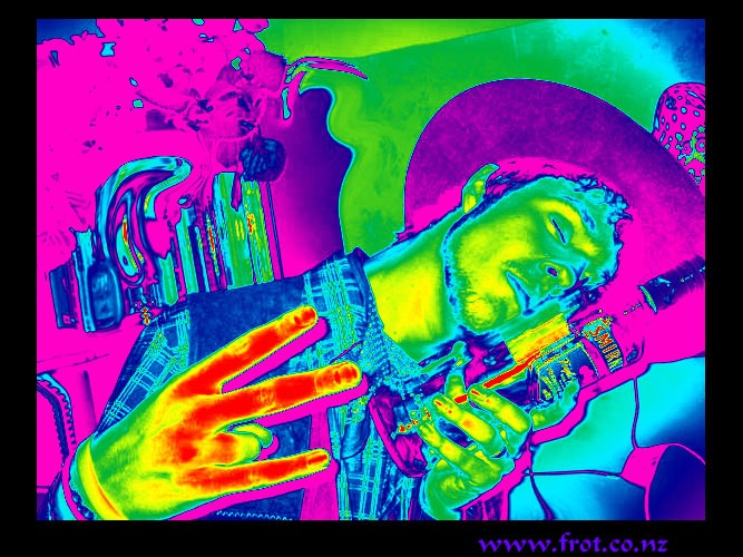
The more primary and vivid the better, because a white background with black font might as well be a book, and grey sucks the very life out of people’s minds.
In a world in which many people are afraid to express themselves with colour, (Or with anything at all really) there is no reason why the internet has to blend in. Whatever colours you choose someone will hate them – unless you choose grey of course, nobody hates grey…
DO IT YOURSELF
Sometimes it’s worth paying someone else to sort out your site, but like many things, web design has grown into a giant and mysterious subject dominated by “experts” – thankfully WordPress has done a lot to reverse that, but now most people just post their crap on Facebook where it disappears without trace in a few days.
99% of the time no knowledge of “code” (HTML) is required at all to make a fully functional website. It’s not that hard, and very few people other than web geeks take much notice anyway – it either works or it doesn’t
LEAVE GAPS
Each idea benefits from being separated by a space – an entire paragraph in one go is far too many words for a person running in information overload mode. Often any more than three lines of text without a space is overload. Time for a picture!
WWW.FROT.CO.NZ
WE MOVED OUR WEBSITES OVER TO WORDPRESS

When we did our first website in 1998 we used FrontPage 98 and posted our pages on a Paradise Homepage.
In 2004 we switched over to Dreamweaver MX2004 and moved our pages to Free Parking, where they have been ever since.
We long put off modernising, but in September 2015 we moved our main site Nature Foods over to Open Cart, and in November 2015 moved our other sites over to WordPress.
One of the confusing things about WordPress is the huge proliferation of themes, as there are thousands of them, both free and paid.

We basically just want a blank slate with plenty of custom options when designing our sites, and are using a theme called BLDR which we find good. We later upgraded to the paid version – BLDR PRO which costs a very reasonable NZ$28, because we wanted to get their support and to do a couple of tweaks to the code. They are very helpful and we recommend Modern Themes highly.
Although WordPress is known mainly as a blogging platform, it is also the most popular CMS – Content Management System – and it’s been estimated that as of 2015, over 75 million websites are on WordPress.
We initially considered some other options, such as Joomla, but decided on WordPress because we found it easier to use, and the support is really good.
WWW.FROT.CO.NZ
PHOTOS
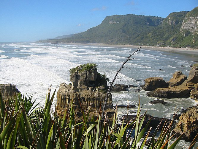
Most of the photos on this site were taken by Ian Gregson, using small Canon digital cameras. To see more photos, or to read the opinions of a complete punter with a cheap pocket camera, see the the photos section.
We keep experimenting with the optimum image sizes for our websites, so there are quite a mix of sizes here.
COPYRIGHT
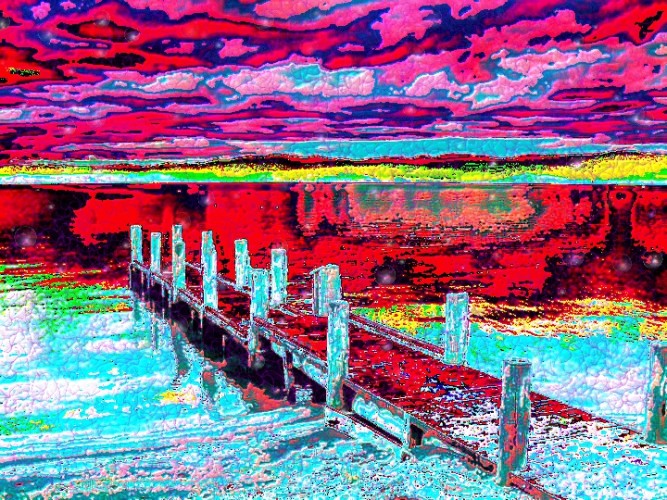
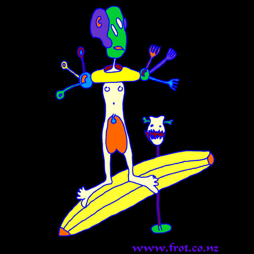
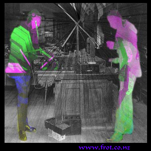
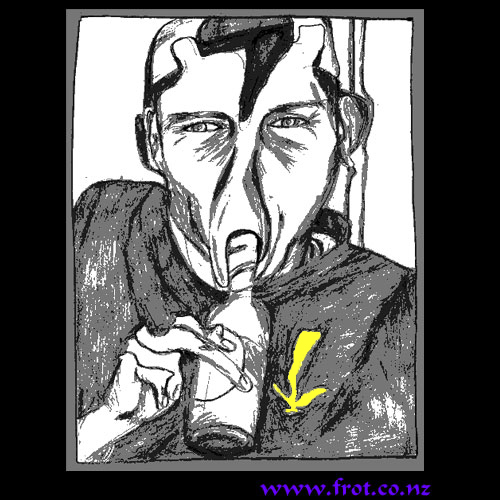
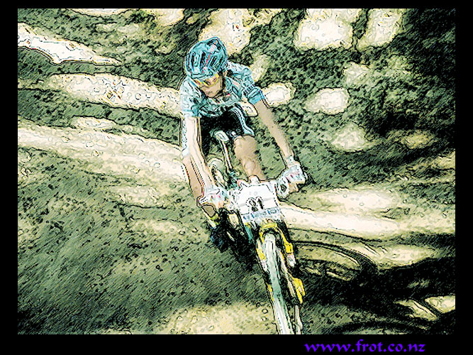
As well as photos, most of the artwork on this site is by Ian Gregson, and includes paintings, drawings, and photoshopped photos, logos, and graphics – if you rip any of it off we will track it down using embedded watermarks and sue you for $500,000 per item… yeah right.
WWW.FROT.CO.NZ
WHAT DOES “FROT” MEAN?
We get asked this from time to time, and notice that some people are afraid to even utter the word. Maybe they think it means something pervy or deviant. Well actually…
We have been using the word FROT since the mid 90’s, when it used to mean “styling” or “going off” – back then people were just “frotting out” (getting excited about cool things), and getting “frotty” (enjoying themselves).
Rather like the word “gay” was hijacked by homosexuals and deemed to mean homosexual rather than happy, the word “frot” has to some extent also been hijacked by homosexuals and deemed to mean men rubbing their penises together.
Having the domain www.frot.co.nz is probably a bit like the famous NZ brand of ice cream cones “GayTime” – it sounds a bit pervy, but at least it’s memorable, and what the hell, we thought of it over 20 years ago
Frot was actually first used in the pervy sense to describe Japanese train frotters in the 80’s – men who rubbed themselves up against women in crowded subway trains.
WHO DID THIS STUFF?
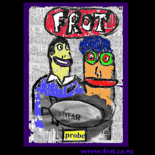
Frot Design is the work of Ian Gregson and Deb Gully. This Frot site is mostly Ian’s stuff, while Deb’s stuff is mostly linked to www.debgully.com
WHERE ARE WE?
www.frot.co.nz

