DEMANDS FOR A BETTER STEEMIT
MY UNREASONABLE LIST OF DEMANDS FOR A BETTER STEEMIT
While we are all thinking about changes and updates to Steemit, I’d like to post my Xmas wish list
Only a week ago the site wasn’t working at all and we couldn’t even vote or comment, so before anyone loops out and says I’m a dangerous lunatic who should be arrested, I’d like to say upfront that I’m happy that the site is working again and these are all just personal opinions.
THE LOGO

I think the existing logo is great, really memorable and recognisable. To separate the Steemit logo from Steem, a basic change like putting the Steemit logo into an oval or something could make it look a bit different. It could easily be changed to the new turquoise colour and “Steem” changed to “Steemit” (like I just did above)
The new logo is a bit bland and forgettable, and we could probably design a better one. If it really has to be changed there could be a logo design contest and vote, so at least we all get to see some other options.

THE NEW COLOUR (color)
Although some people think the new turquoise is too light and doesn’t contrast with the white background enough for links, I think it works OK.
Turquoise is not a colour I would have chosen myself (I would have picked purple!) but I actually kind of like it, and I like that it gets away from fakebook blue.

But I do have other issues I want to bleat about
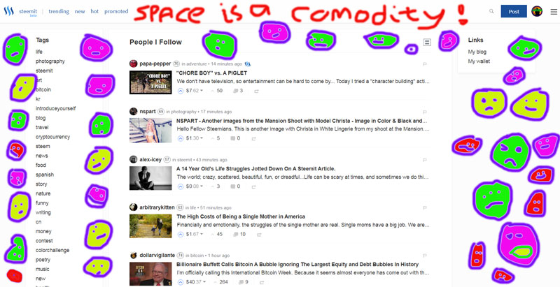
LAYOUT AND WASTED SPACE
That bloody great waste of space on the right hand side, which is not such a big issue on a desktop, but really screws things up on a tablet.
It needs to be combined into one list – tags and links combined, and it needs to be all on the right hand side so that it is convenient for most people to use.
For a right handed person (and that is about 85% of the population), having a menu on the left hand side is like putting your shoes on the wrong feet.
BACKGROUND COLOUR
It’s great that there is now an option to choose between a light or dark theme, but I think there needs to be a middle option.
I’m into colours and its not often I say this, but I think there needs to be a grey theme (“early morning fog”)
Grey backgrounds are relaxing and easy on the eye – they make everything else stand out with good contrast. I always use grey for my background colour when I’m using Word or Markdown, and for a lot of my emails.
And even more things I’d like to see changed
AN INTRODUCE YOURSELF PAGE FOR EACH ACCOUNT
This would be a page where you could post stuff about yourself and update it anytime. There would be a link to it so that people could actually find it and see it.
The “introduce yourself” tag idea doesn’t work at all. Half the “introduce yourself” posts are fake anyway: https://steemit.com/introduceyourself/@sift666/i-am-new-to-steamit and most people don’t read them because they don’t know the new people or want to read about random newbs.
As things are, if you do want to learn more about someone, you have to search all their posts in the hope of finding a hopelessly out of date post from when they were starting out. And what a newb posts is very different from what they would post once they know shit from chewed dates.

FLAGGING
I want to see that bollocks GONE!
A downvote could carry the average weight of the upvotes on that comment or post.
Why should a fired up numpty with $800 in their wallet be allowed to censor a comment by some lowlife plankton with only $2.45 in their wallet?
Flagging is censorship by those who have more money, exactly like in the real world, but Steemit does not have to be the same as the real world!
I gather from some of the comments on my previous posts on this subject,
that a few people strongly disagree with this opinion (but most of them are not plankton…)

IN SUMMARY
This is what I’d like to see:
KEEP THE OLD LOGO
SWITCH TO THE NEW TURQUOISE COLOUR
PUT ONE COMBINED MENU ON THE RIGHT SIDE
TIGHTEN UP ALL THE WASTED SPACE
INCLUDE A GREY BACKGROUND OPTION
ADD UPDATABLE AND LINKED INTRODUCE YOURSELF PAGES
GET RID OF “FLAGGING” (CENSORSHIP)